The Towers Growth brand story
We are so excited to share that after years of doing contract marketing work and helping businesses grow, we’ve officially launched our business, Towers Growth. You’re scrolling on our stunning new website, we have a team of specialists in place, and we’re more ready than ever to help B2B companies in physical industries grow.
So how did we get here?
We’re going to share the behind-the-scenes process of how Towers Growth got started, from our brand values to our visual identity.
The Towers Growth brand story
It started with me, Mackenzie Yates. I kept seeing the same thing with clients I was working with doing contract marketing: They were growing successfully through referrals…until they hit a ceiling. They would inevitably plateau and get stuck.
I knew standard marketing advice didn’t work for this situation. Getting more followers, subscribers, and leads doesn’t translate to new customer growth. It more often leads to wasted energy and no new revenue.
I wanted growth to feel solvable, not chaotic, by aligning marketing strategies with what will actually drive new customer growth. I built Towers Growth to fill that gap and get my clients qualified leads — which will always be more valuable than more LinkedIn followers.
Here’s the story of how we went from concept to company.
The name ‘Towers Growth’
Picking the name was easy. Giraffes have always been a source of inspiration and beauty to me, and a group of giraffes is called a tower. They’re graceful, they’re unhurried, and they see what others can’t yet see because of their height.
That’s the kind of approach we bring to growth. We’re unhurried. We’re strategic. And we’re informed by a bigger viewpoint.
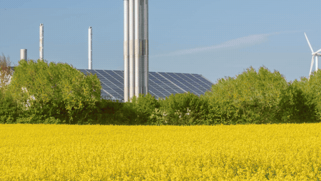
Our clients typically come to us after not being understood properly by other agencies. They need a team who can quickly understand the technical offerings they provide and find a way to clearly communicate their offerings to the market. I come from a background as the marketing manager for a safety & health consulting firm that served the construction, metals, and manufacturing markets. I’ve learned how valuable industry-specific language is for building trust with prospective (and existing) customers.
We’re proud to speak the language of our clients’ industries and to help them translate their expertise into connection with customers. “Towers” subtly implies that we’re ready to get to work building alongside people in these sectors (even though we don’t have an actual building to show for it at the end).
To that end, our approach to marketing is defined by these five principles:
Methodical: From our strategic marketing systems to our relentless attitude toward our clients’ growth, we are intentional in all that we do. We create focused processes for you to reach new prospects, reliably and repeatedly.
Honest: We’ll tell you what’s working, what’s not, and what needs to change. We give informed and honest advice and only make recommendations we genuinely believe will work for you.
Grounded: We are measured and collected in our approach. We don’t chase trends; we apply what we’ve seen work.
Approachable: We join your chat groups, come to team meetings, and build within existing systems. Our clients consider us an extension of their team who truly gets them, inside and out.
Focused on outcomes: Traditional marketing agencies promise a set number of deliverables with no guarantee that those deliverables will actually work for their clients’ unique businesses. Instead, we center our work around outcomes and create (and adjust) marketing strategies to achieve them.
Our brand design
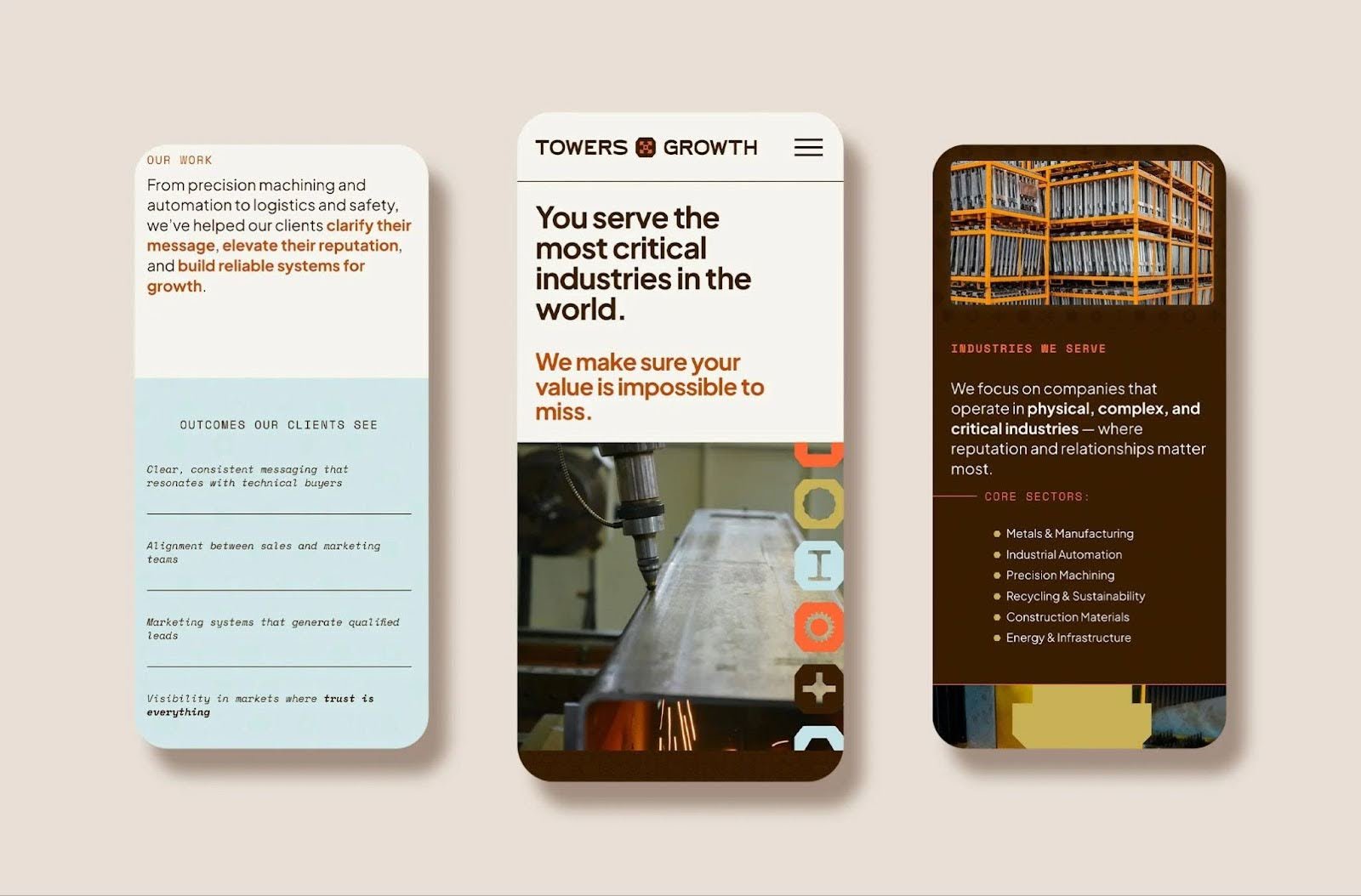
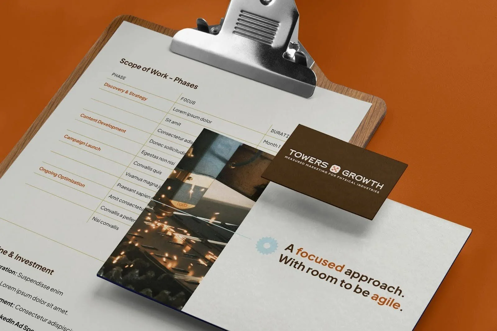
With our ethos and approach nailed down, our branding was the next step, and we’re proud of each element of the website you’re on right now. We worked with Annie and Shelley at Happenstance Design to bring Towers Growth to life and build our visual identity.
The logo
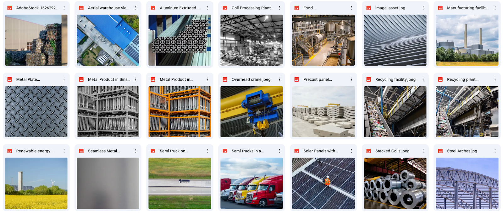
When we started on the brand project, we had a folder of images representing the different industries we work with.
This image of T-slot bars immediately stood out for the unique shape, but also the arrow-shaped corners, which made us think of growth.
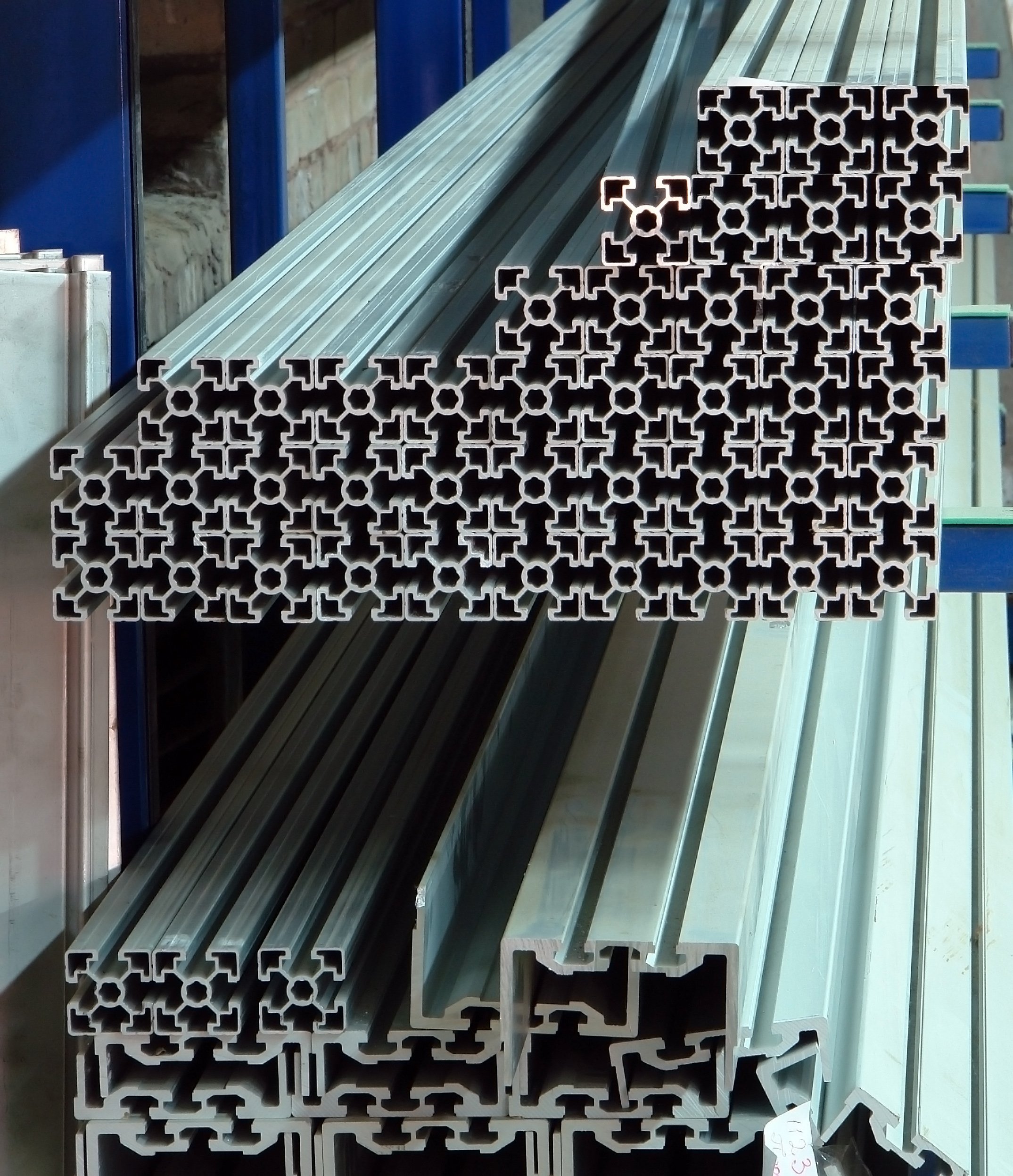
If you’re immersed in the manufacturing world like we are, you know what this is immediately. If not, T-slot bars are typically used for creating modular structures that can be easily set up and modified.
They reminded us a lot of the systems we create for clients. We set up programs that can be modified as needed to meet our clients’ needs month over month. We’re grounded in what we offer, but we can flex the details of our partnership to make sure you get exactly what you need from us.
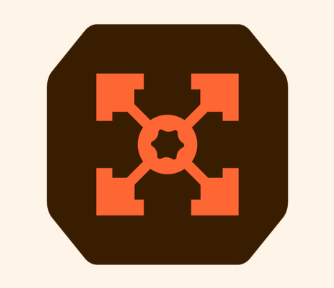
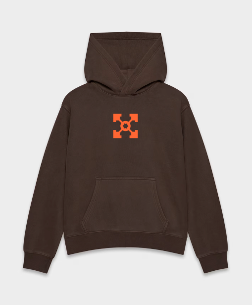
So, after some back-and-forth with our designers, our logo mark was born:
The font
I am pretty passionate about typography, so I got really excited about this step. I made a moodboard for Happensance to get a feel for my design style. I was drawn to logos in the industrial sector with strong typefaces, like Milwaukee and Carhartt. I also have a clear love for vintage design and 1970s colors and icons:
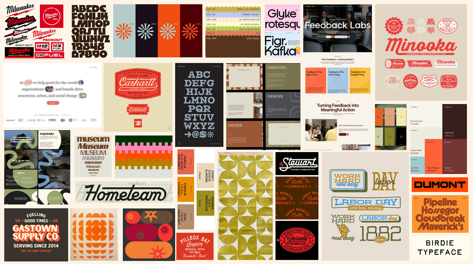
Our incredible design team brought all this inspiration together and helped us land on this logo — I think they nailed it!
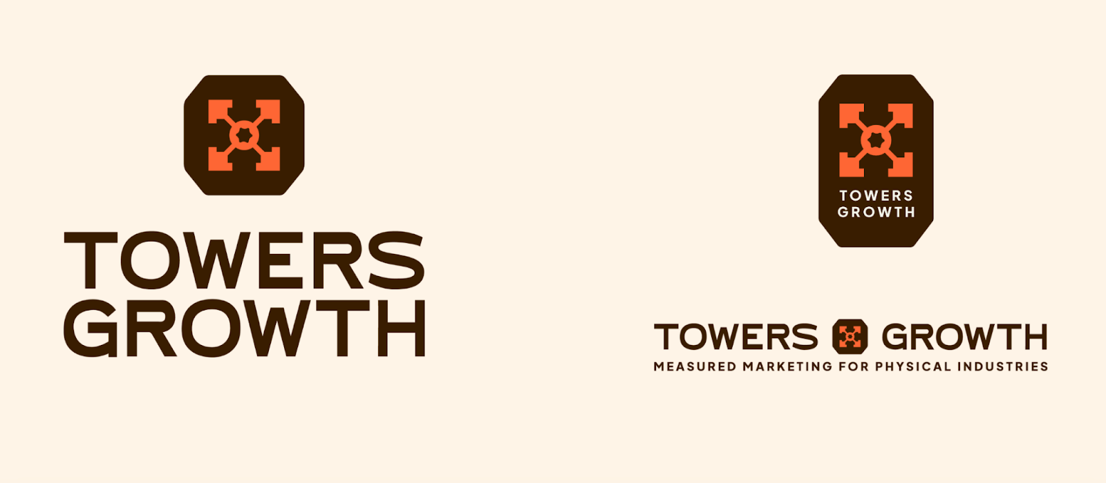
We headed in the direction of rich orange paired with browns, greens, and soft blue to stay authentic to our fresh yet grounded attitude as a business. We wanted funky accents while still feeling rooted and polished.

The icons
To supplement our logo and scatter around our website, we chose a series of other shapes we found among our client’s worlds.
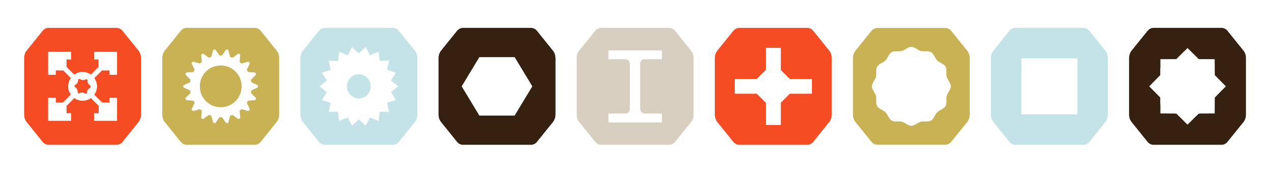
From left to right:
T-slot: The iconic shape we know and love
Traditional gear: A classic shape across industrial sectors
Pinion gear: Frequently seen in the center of the planetary gear systems that our client machines
Hex bolt: Used for structural steel connections, machinery assembly, and automotive applications
I-beam: Used for strength and support in building structures, often stored in the metal service centers we support
Phillips screwhead: A shape we see in high-speed, automated production environments
Reaction bar: Serves as a counterforce mechanism in torque-driven tools
Square screwhead (aka Robertson screw): Provides superior torque, self-centering, and high resistance to slipping
Double square screwhead: Designed to reduce stripping and maximize torque
These shapes are sprinkled all over the pages of this site, and we couldn’t be more obsessed. This is one of the things the Towers team was most excited about as we saw the brand come together.
We worked with our editing & animation contractor, CJ Gilbert, to create these hypnotizing GIFs once the brand was done. We’ve spent quite a bit of time sitting and staring at these in wonder.
The launch
After a few iterations of the final elements, we launched. Our new website is full of free resources, stories from our clients, FAQs, the faces of our team, and deeper descriptions of all we do.
Even though we’ve been doing this for a long time, this is just the beginning. We’re so excited about clients we haven’t met yet who are ready to meet the clients they haven’t met yet.
If Towers Growth seems up your alley, we’d love to talk shop. We specialize in account-based marketing and content marketing for companies who need to clarify their message, elevate their reputation, and build reliable systems for growth. Let’s get the conversation started!